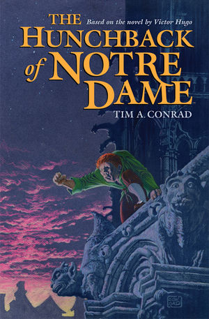
 There have been countless adaptations of Victor Hugo’s masterpiece “The Hunchback of Notre Dame.” Most have either bastardized the story and only a few have came close to Hugo’s true intentions.
Tim A. Conrad’s graphic novel version falls into the later.
Conrad’s version may be a simplified retelling of a 700+ page 19th century novel, focusing only on Quasimodo, La Esmeralda and Claude Frollo with Phoebus and Clopin Trouillefou appearing very briefly in two scenes, but it is a good introduction to the book. Conrad also does not treat the story like it’s for children, which it really isn’t. He keeps all the dark feelings the characters have for each other, like Frollo’s forbidden love for La Esmeralda, which eats away at his soul- due to him being an archdeacon.
Some other positives about this adaptation, which make it close to the original novel are Quasimodo being deaf, Phoebus wanted La Esmeralda for one night instead of actually falling in love with her and all the torture that appears in the novel, plus the sad ending.
Of course, since this is a simplified version of the novel, Conrad spends the first half of the book solely on Quasimodo and then the second half of Las Esmeralda and Claude Frollo- which does not give the full scope of the original novel.
The artwork fits perfectly with the story in that Conrad made it look like artwork found on stained glass windows. This is a clever idea seeing as how most of the novel does take place in or around Notre Dame. It doesn’t look cheap or gimmicky at all and every panel is as well drawn as the last. Although some of the angry faces the characters make do look a little goofy and take away the effect of the drawing, the visuals are still impressive.
Conrad’s graphic novel version may be simplified, but it’s not watered down; the solid story and the stained glass window art style is a great fit. It’s safe to say you can find sanctuary in this graphic novel.

Leave a Reply