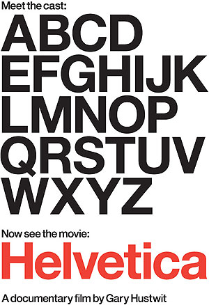
 At the end of a hectic week, I turn to my Netflix instant queue to find something to watch that doesn’t demand too much brainpower, but is also not complete nonsense. I come across Gary Hustwit’s documentary entitled “Helvetica,†and start reading the description. The first thing I wonder is what could be so interesting about a documentary about a typeface? Initially, it sounds to me like something one of those stiff grammar school teachers would make you watch on the last day of school like it was some sort of ‘treat,’ but was so boring you would be wishing you were solving long division equations instead. Sort of like the subject of one of those torturous filmstrips they would make you watch about honeybees or how a textbook is made; but I digress. “Helvetica,†thankfully is not reminiscent of any of those things, and actually turned out to be just what I wanted it to be -refreshing and light, yet interesting.
Right from the start, I am enjoying the interviews and the history and origins of the typeface Helvetica; it is more interesting than one would think. The idea that most of the text we see in our everyday lives – on signs, on doors and windows, in advertisements, and products we buy has a commonality to it is fascinating. The idea of having awareness and stopping to think about minuscule things in our world that most people just glaze over is sort of therapeutic in a way.
The shots of subway signs, company logos, traffic signs, and NASA shuttles using the Helvetica font while a bouncy, light music plays in the background is almost calming and relaxing to watch. Like the font itself, the scenes are smooth and clean with voices of the designers and publishers calmly lulling the story to the camera. Their job must be non-stressful, almost like a sculptor, using their visions to craft and sculpt type into something pleasing and non-intrusive to the eye. Helvetica in particular, was a typeface created to be clear and neutral, so as not to represent meaning in words, but let the words speak for themselves.
Of course, I was waiting for the time where the documentary would turn the subject around and show people who instead of revering Helvetica, think of it as a travesty in design. Halfway through the film, the director did exactly this, and interviewed designers and publishers who thought of the font as representing everything from capitalism and consumerism, to globalization because it is so widespread in it use. The fact that Helvetica was seen to be conformist and boring created a backlash of designers who decided to get more creative and expressive in their typefaces in the 1970s and beyond. Some of these designers seem to fail to realize the worth in the Helvetica font because if it wasn’t for the explosive popularity of this typeface, and the simple design of it, there would have been no inspiration for them to react against it in their designs. Thus, the Helvetica font succeeds on two levels; being a clean, legible design which is the most widely utilized typeface, and causing the movement of wild, creative and unusual new typefaces we have seen in the last 30 years.
Being aware of the thoughtfulness and creativity that goes behind the lettering of everything we read on a daily basis is what the film “Helvetica†really highlighted for me
Although the film was a little on the long side, it’s a film I would recommend to instant queue if you’re in the mood to get lost in the little details of life.

Leave a Reply